Don't make your customers take a leap of faith
It's hard enough to get someone to sign up for your service from your website. Don't make it any harder by asking too much of your potential customer. Getting them to click on something when they have no idea what will happen next can be a real deterrent in your signup workflow.
Put yourself in your customers shoes. You get to a website and you are interested in their service. They have a free trial you would like to do. You come to a place on their site where you see this:
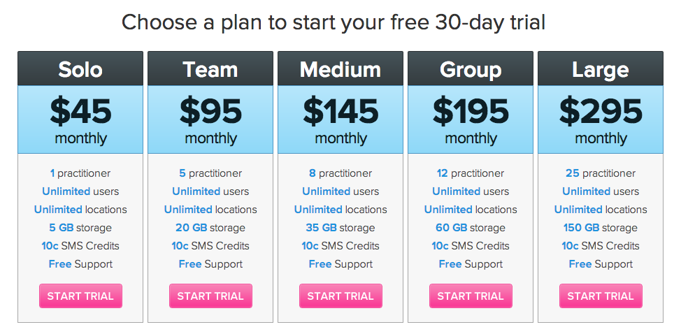
What happens when you click that Start Trial button? It might be:
- Go to a signup page where you now fill in a lot of details and then you get to do a trial.
- It takes you to a contact page to speak with a sales person to organise a trial.
- It logs you straight into a new account and lets you try the software.
- It takes you to a page that says "We don't really have this product, but good to know you were interested, now we'll build it". (People really do that kind of thing and it's very annoying)
The point is, you don't know what's going to happen when you click that button, so you may not click it. This is asking your potential customer to take a leap of faith. They don't trust you yet, they aren't sure they like your software yet, so you'll have a lot of people that just won't do that.
So how do you improve on this? Well if you were going to take them to a signup page afterwards, replace the button with a simple signup form.
So your page would change to something like this:

Now there is no guesswork, they can see that they need to enter a few details and that begins their trial. Of course you need to make sure your copywriting clear indicates what happens next from here.
How many people are not taking that leap of faith on your website?
Disclaimer: A/B testing is awesome. Any changes to your website should be measured to see the affect on your key metrics (eg. conversions).